> ## Documentation Index
> Fetch the complete documentation index at: https://wb-21fd5541-sdk-testing-latest.mintlify.site/llms.txt
> Use this file to discover all available pages before exploring further.
> 메트릭을 시각화하고, 축을 사용자 지정하고, 범주형 데이터를 막대로 비교합니다.
# 막대 플롯
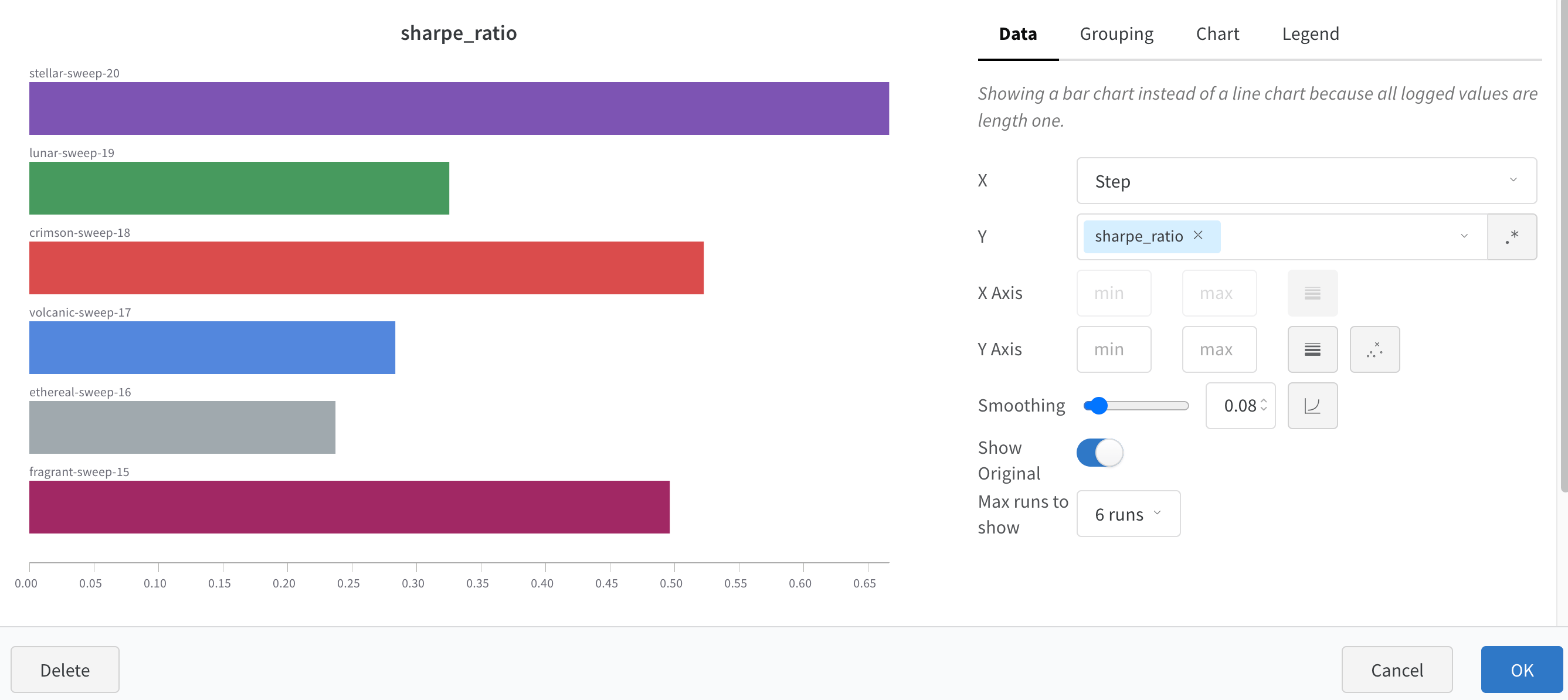
막대 플롯은 범주형 데이터를 직사각형 막대로 나타내며, 막대를 세로 또는 가로로 그릴 수 있습니다. 막대 플롯을 사용하여 메트릭을 시각화하고, 범주형 데이터를 비교하고, Runs의 축을 사용자 지정하세요. 로깅된 모든 값의 길이가 1이면 `wandb.Run.log()`에서 기본적으로 막대 플롯이 표시됩니다.
차트 설정을 사용하여 표시할 Runs의 최대 개수를 제한하고, 임의의 설정을 기준으로 Runs를 그룹화하고, 레이블 이름을 변경하세요.
## 막대 플롯 사용자 지정
**Box** 또는 **Violin** 플롯을 만들어 여러 요약 통계값을 하나의 차트에 함께 표시할 수도 있습니다.
박스 플롯 또는 바이올린 플롯을 만들려면 다음과 같이 하세요.
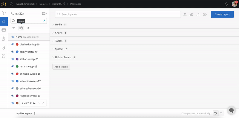
1. Runs table에서 Runs를 그룹화합니다.
2. Workspace에서 **Add panel**을 클릭합니다.
3. 표준 **Bar Chart**를 추가한 다음, 표시할 metric을 선택합니다.
4. **Grouping** 탭에서 **Box** 또는 **Violin**을 선택해 해당 스타일로 표시합니다.
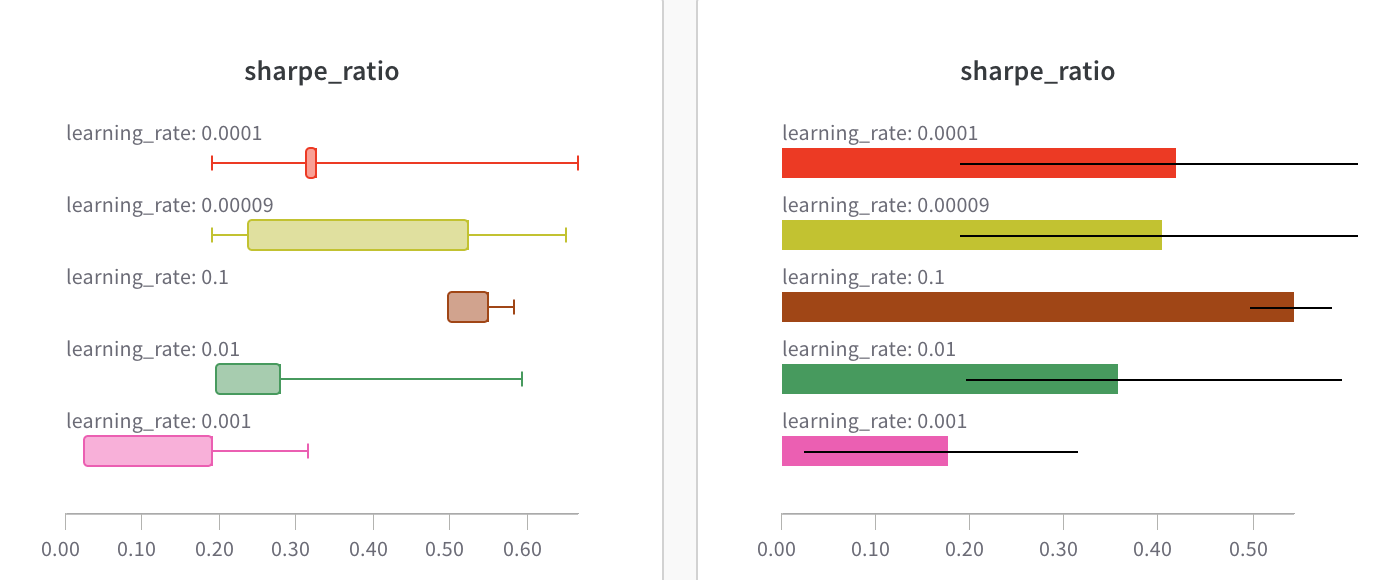 차트 설정을 사용하여 표시할 Runs의 최대 개수를 제한하고, 임의의 설정을 기준으로 Runs를 그룹화하고, 레이블 이름을 변경하세요.